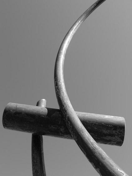
 [Image © 2006 Kelly Hoffart] I hope you like it. It's sad, really, that the one time I get to take advantage of my sponsored TotalFark account for the new Farktography contest, I don't have any pictures that I think will do really well in it. None of them made me say "wow" when I first saw them, so they won't have that effect on anyone else. Damn theme. Go there and vote for them anyway (username: SirJello37) if you really love me.
Thursday, February 16, 2006
Minimalism: Less is More, but Here's One More Anyway
[Image © 2006 Kelly Hoffart] I hope you like it. It's sad, really, that the one time I get to take advantage of my sponsored TotalFark account for the new Farktography contest, I don't have any pictures that I think will do really well in it. None of them made me say "wow" when I first saw them, so they won't have that effect on anyone else. Damn theme. Go there and vote for them anyway (username: SirJello37) if you really love me.
Subscribe to:
Post Comments (Atom)
I really like this photo - I'd frame it and hang it on my wall. Nice clean, balanced lines, and the black and white really works.
ReplyDeleteBut what do I know? Most of my photography consists of posing my hounds in awkward situations. ;-)
Anyway, I voted for you over on Fark. Good luck!
Thanks! And thanks for sponsoring me over there. I wish I could take advantage of it more.
ReplyDeleteI will make the shot available on my web site when I get a chance (at least up to 11x14, I'm not sure how larger sizes will look). Maybe even on art.com.
It's really, really hard to do this minimalist stuff. I can't hardly find anything that really works for it.
Argh, blogger lost the last comment I typed up, so if I sort of double-post this, don't blame me, blame the stupid intarwebs.
ReplyDeleteAnyway, I think your minimalist stuff is extremely good, and I really enjoy it. Anyone can look at a landscape or a sunset and know it would make a good picture, but to look at a ring or a lime in sprite and see a good picture is really impressive.
So even though it's hard, I hope you keep it up! Seriously, I really like your latest stuff!
Cool shot. I dig the clean lines and creative use of negative space. Makes me think of the hammer and sickle a bit... LOL
ReplyDelete